Small Fixes, Big Impact: What a Heuristic Evaluation Revealed About One Small Business Website
- Venisha Henry

- Mar 16
- 6 min read
Updated: Apr 24
When Great Care Meets a Busy Schedule
MC Care is a small physical therapy practice that does what all great healthcare providers do — they pour their energy into their patients. The kind of thoughtful, personalized care they offer doesn't happen by accident; it takes focus, time, and genuine dedication.
But that same focus means that things like website can quietly fall to the back burner. Similar to many small businesses, the person managing their website also holds a full-time role with their company, which means having a precise, lightweight roadmap for their site allows them to make quick, confident updates without adding to an already full plate.
Bringing in a Fresh Set of Eyes
That's where we came in. The Insight Ward conducted a heuristic evaluation of MC Care's homepage — a structured UX research method that uses established usability principles to identify where a website is working well and where it might be creating friction for visitors.

The Framework Behind the Findings
Our team worked through 8 of Nielsen Norman Group's Usability Heuristics, each broken down into a set of guiding questions. Some of those questions were marked as critical (⚠️ )— meaning they represent non-negotiable standards that every site should meet. If you're curious about what heuristic evaluations are and why they're such a powerful tool, I go deep on that in our article "Planning a Redesign?A Heuristic Evaluation Pinpoints What to Fix First."
What to Fix First


The Results, Straight From the Data
For now, let's jump into what we found — and the practical takeaways that any small business can apply to their own site.
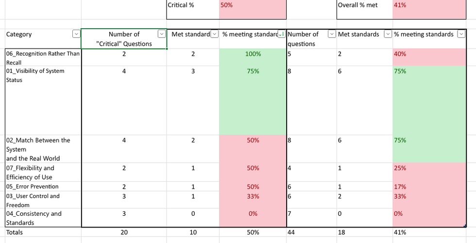
The evaluation found that MC Care's homepage performed strongest in Visibility of System Status and had the most room for growth in Consistency and Standards.

Visibility of System Status
Visibility of System Status is about keeping users informed — making sure the site is clearly communicating where they are, what's happening, and what to expect next. Think of it as the website's way of saying "You are here, Here's where you can go next."
MC Care's homepage did a solid job here. From clear navigation cues to system alerts and loading behavior, users are kept in the loop throughout their experience on the page.
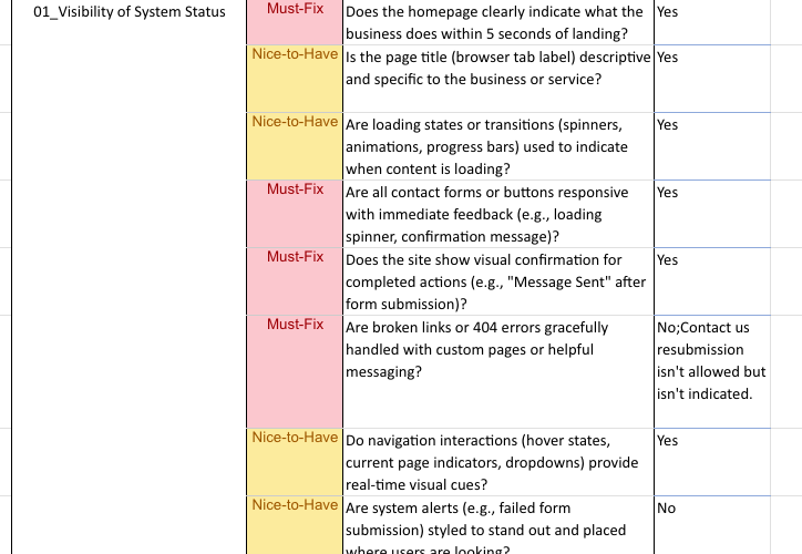
To evaluate this principle, I worked through 8 guiding questions — here's what I found on MC Care's homepage.
⚠️ Does the homepage clearly indicate what the business does within 5 seconds of landing?
Yes, Icon states Physical Therapy, though H1 could be more succinct.

Is the page title (browser tab label) descriptive and specific to the business or service?
Yes; Browser tab clearly states name of business.

Are loading states or transitions (spinners, animations, progress bars) used to indicate when content is loading?
Animation appears while page load

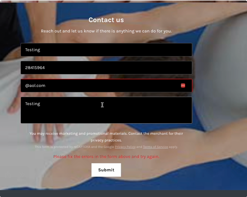
⚠️ Are all contact forms or buttons responsive with immediate feedback (e.g., loading spinner, confirmation message)?
Yes; Spinner for contact form present.
⚠️ Does the site show visual confirmation for completed actions (e.g., "Message Sent" after form submission)?
Yes; Confirmation appears after the submission of contact form.

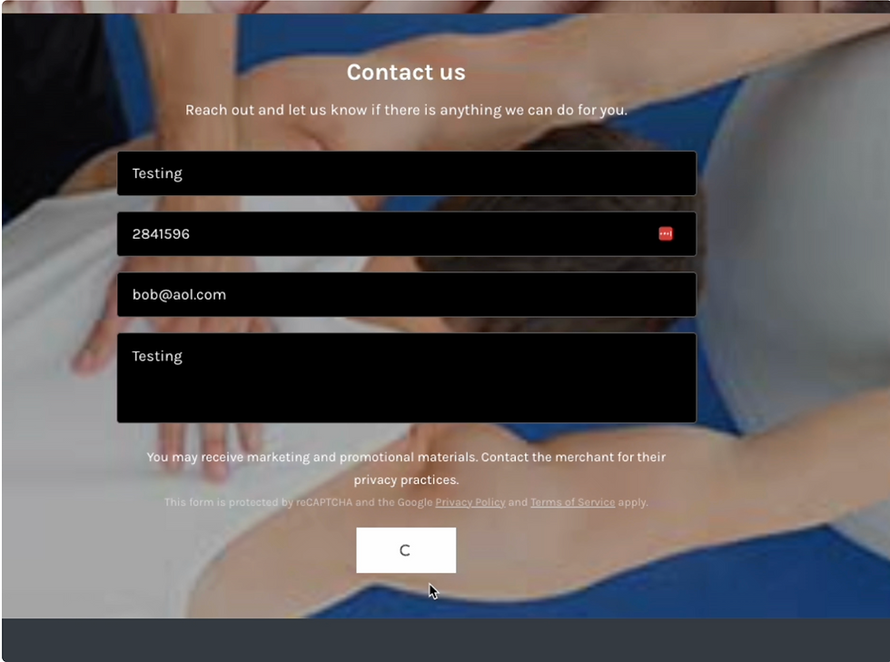
⚠️ Are broken links or 404 errors gracefully handled with custom pages or helpful messaging?
No; Contact us re-submission isn't allowed but isn't indicated.
I was unable to capture on screen share.
Do navigation interactions (hover states, current page indicators, drop-down) provide real-time visual cues?
Yes; Buttons, links, contact form fields all have hover states.
Are system alerts (e.g., failed form submission) styled to stand out and placed where users are looking?
Yes, Users are informed and fields are highlighted
Consistency and Standards
Consistency and Standards is about creating a predictable, trustworthy experience for your users — one where buttons look like buttons, links behave like links, and the language across the page means the same thing every time. When this principle is working well, users don't have to think twice. MC Care's homepage has some great bones, and the good news is that the opportunities identified here are very much in the "small tweaks, meaningful results" category.
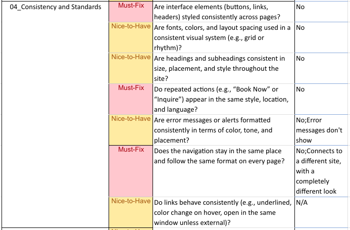
Let's take a look at what the questions revealed.
⚠️ Are interface elements (buttons, links, headers) styled consistently across the page?
No; Buttons are of varying sizes,style, and colors.
⚠️ Do repeated actions (e.g., “Book Now” or “Inquire”) appear in the same style, location, and language?
No; Both "Book now" and "Book" copy are used as button and link.

Are fonts, colors, and layout spacing used in a consistent visual system (e.g., grid or rhythm)?
No, Though only one font is being used. Font colors vary based on background and the blue font doesn't pass accessibility testing
Font sizing and weight makes for a difficult read.
3rds grid in place but not respected, H1 of the header is quite heavy and creates in balance in the ryhtm of the page.
Are headings and subheadings consistent in size, placement, and style throughout the site?
No; Lengthy H1, Headers of sections are inconsistent in size and placement.
Are error messages or alerts formatted consistently in terms of color, tone, and placement?
No; Error message displayed for email format but not number format
Disabled submit button was unclear even with cursor blocking
⚠️ Does the navigation stay in the same place and follow the same format on every page?
“Book now” connects to a different site, with a completely different look.

Do links behave consistently (e.g., underlined, color change on hover, open in the same window unless external)?
Yes, Navigation links become underlined, and open with the same window.


Recommendations
Every finding from this evaluation points back to one thing — small, intentional decisions that add up to a much smoother experience for your users. Here are the top takeaways.
Create a simple button system
Not all buttons are created equal, and that's actually a good thing. A clear button hierarchy helps users instantly understand what action matters most. Primary buttons (bold, filled) are for your most important actions. Secondary buttons (outlined) support those actions. Tertiary buttons handle the optional stuff.The key is consistency: once you establish these styles, use them the same way every time.
Across the homepage, there are two paths that lead to booking — a "Book Now" button and a "Book" link in the navigation — but they take users to different places. When a user sees the same intent expressed two different ways, they start to wonder which one is "right."
It's also worth asking: should this be a button or a link at all? The answer comes down to what it's asking the user to do.
Links navigate — they take you somewhere.
Buttons act — they trigger something.
Booking an appointment is an action, which means a button is the right call.
Picking one consistent label, one consistent style, and one consistent destination removes the guesswork entirely.
Use heading tags intentionally
Headings aren't just a design choice — they're how screen readers and search engines understand your page. Every page should have one H1 that clearly names what the page is about. From there, H2s do the heavy lifting as standalone section headers, and H3s handle the supporting details underneath. If two headings look different on your page but are using the same tag, that's worth revisiting. Consistent heading structure makes your site more accessible and easier to navigate for everyone.
Give your navigation some breathing room
If your header is starting to feel crowded, it might be time to rethink what lives there. Insurance information, for example, doesn't need its own spot in the main navigation, it can live below the fold on the page with a simple anchor link that takes users directly to it. Cleaner navigation means users find what they need faster, without feeling overwhelmed the moment they land on your site.
Set expectations around form errors
Error messages are most useful when they're specific and timely. If a user has already submitted a form, let them know they can't resubmit. A simple, clear message goes a long way in reducing confusion and frustration. Users should never be left wondering whether something worked or not.
Check your color contrast
Color is a powerful tool, but it needs to meet accessibility standards to work for everyone. If you're placing light text on a dark background or vice versa, run it through a color accessibility checker to confirm the contrast ratio meets WCAG guidelines. It's a quick check that can make a real difference for users with visual impairments.
This Is Just the Beginning - how this can help MC Care
For MC Care, these recommendations aren't about overhauling everything at once, they're about making targeted, meaningful improvements that compound over time. A consistent button system and cleaner navigation means their part-time web manager can make updates quickly and confidently without second-guessing every decision. Clearer headings and better color contrast means new patients landing on the homepage for the first time get a trustworthy, accessible experience, one that reflects the same level of care they'll receive in the clinic.
That's the real value of a heuristic evaluation. It doesn't just surface problems, it hands you a prioritized, actionable roadmap so you know exactly where to focus your energy.
What you've seen here is one piece of a much larger picture. A heuristic evaluation is just one tool in the UX Research toolkit — usability testing, user interviews, and content audits can take things even further. If anything in this article made you pause and think about your own website, drop a comment below. I'd love to hear what's coming up for you.
And if you're curious about what a deeper dive could look like for your business, I'm always happy to start with a conversation.

Comments